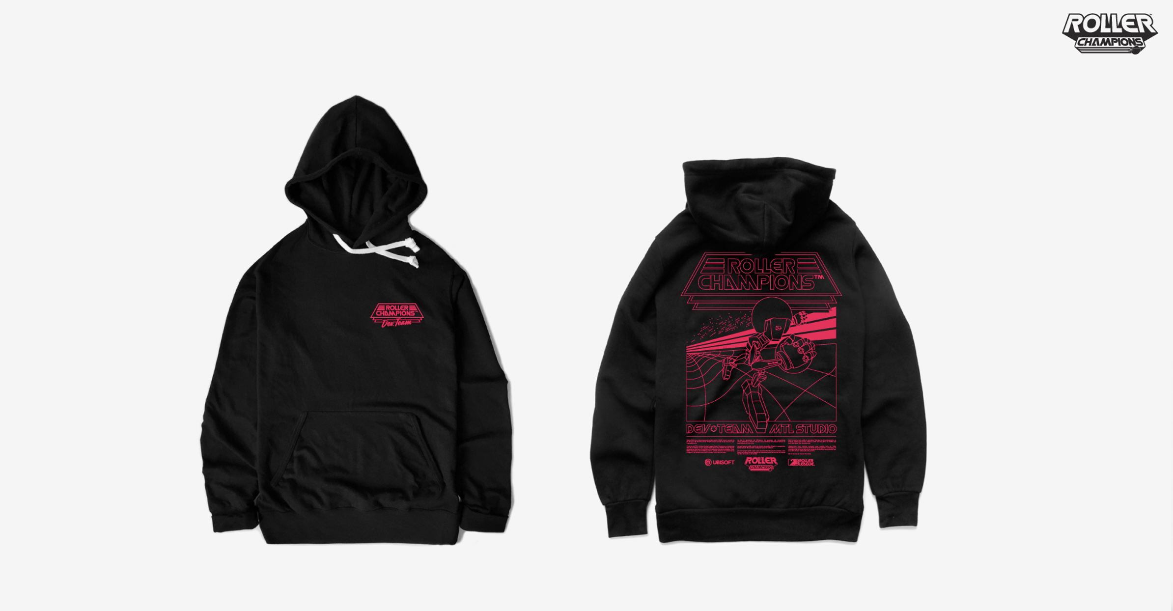
Ubisoft Montreal · 2018–2022
Art Director. External Creative Consultant via 123K. Brought in by Creative Director Gautier Malou specifically for the studio's cultural credibility and visual DNA. Embedded within the core R&D team from day one as a key creative decision-maker. Scope covered the full creative spectrum: brand identity, character narrative, environment direction, UI, skin line strategy for monetization, merch design, convention brand strategy, and cross-team leadership across all departments. Four years shaping every visual and strategic touchpoint of the game.
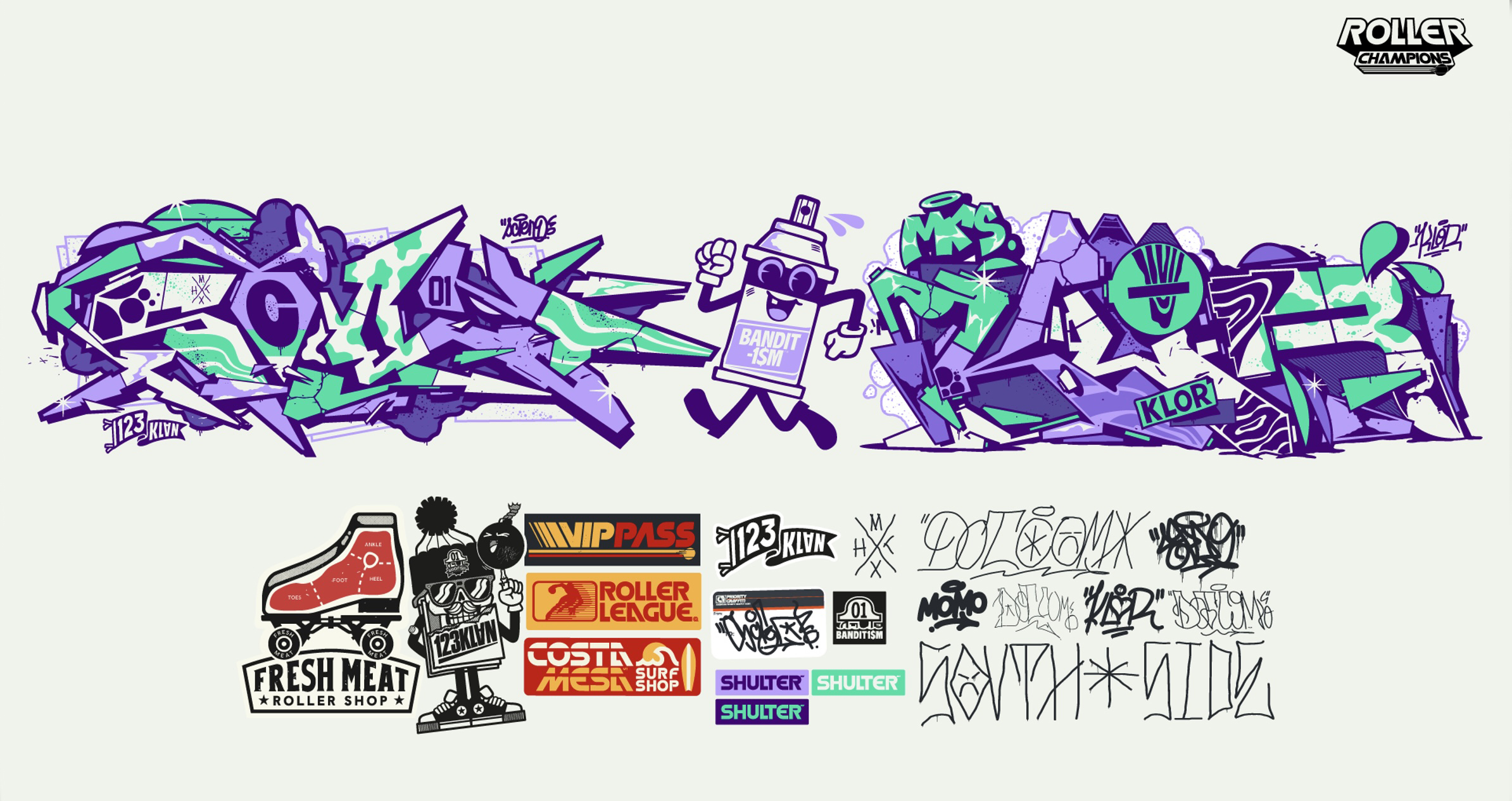
Klor and Scien designed and developed the entire brand ecosystem for Roller Champions. Logo, custom typeface, icon system, and all in-game brand identities, from Roller League to Fresh Meat Roller Shop, Costa Mesa Surf Shop, VIP Pass, and more. Every brand, logo, and visual element within the game world was conceptualized and art directed by Klor and Scien, then implemented through close cross-team collaboration with internal teams and external vendors. A complete visual universe built on cultural authenticity.
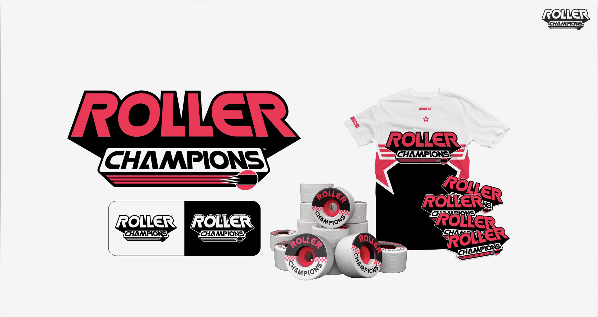
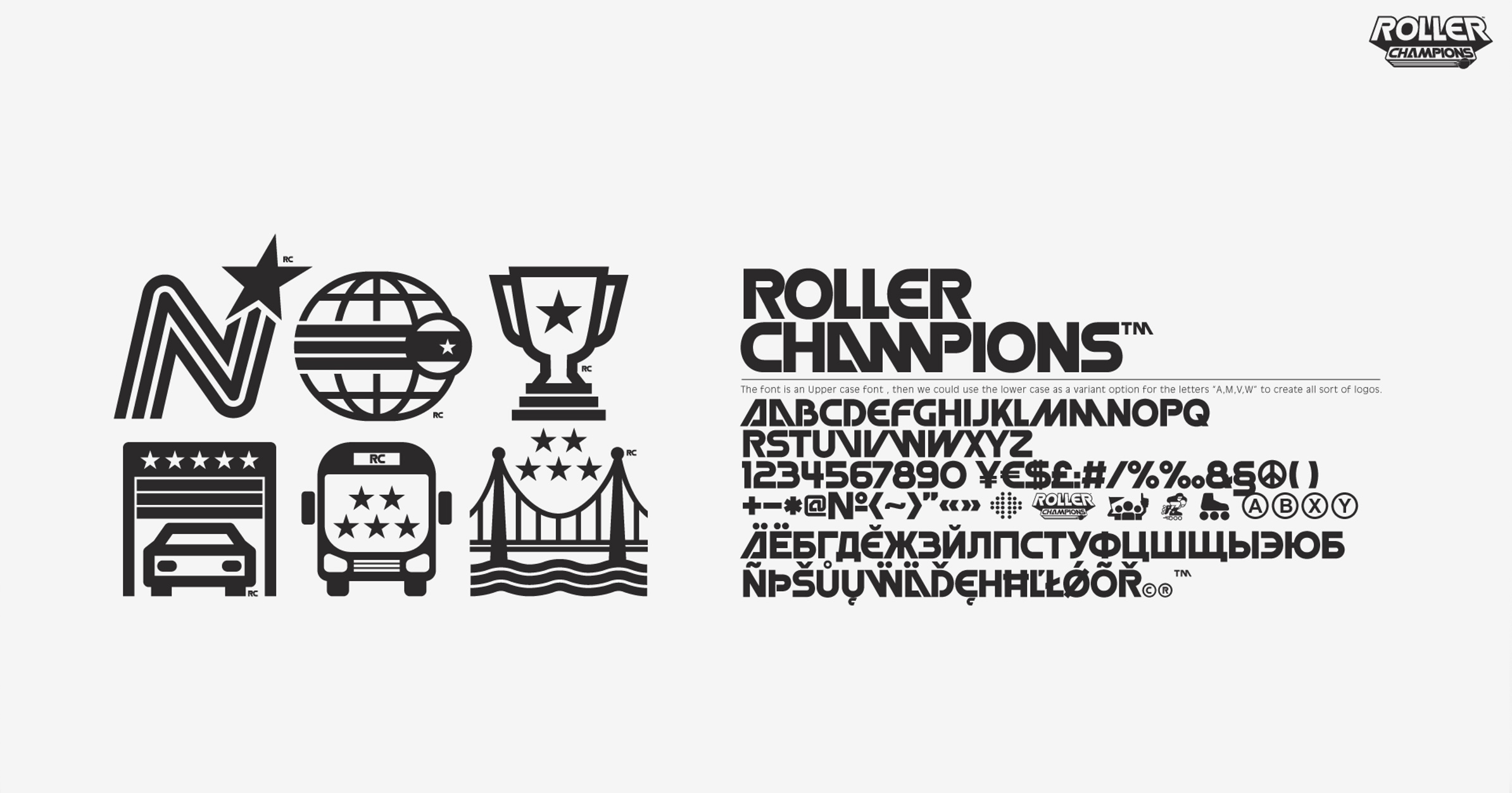
Custom typography, icon system, and in-game brand ecosystem
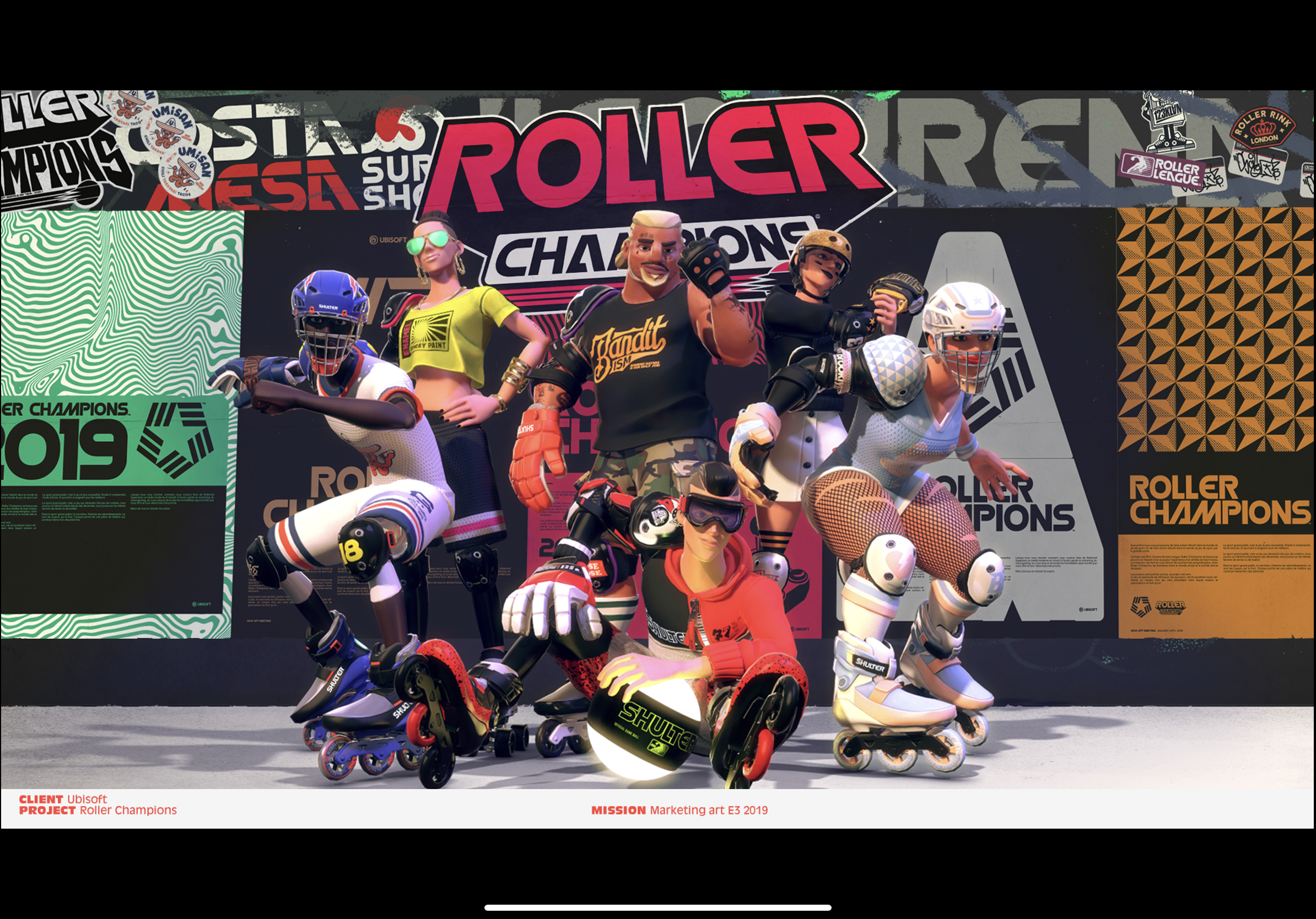
Defined the name, personality, and visual identity of the three founders, each representing a distinct tribe and player archetype. The goal was to create characters that any player could identify with, regardless of their background or style. Asha represents the street culture tribe through warm tones and altruism. Shao embodies the sportswear tribe through neutral tones and self-improvement. Sam channels the fashion tribe through cold tones and personal success. Sam was intentionally designed as androgynous, reflected in the name itself, neither male nor female, allowing every player to project themselves into the character. These three archetypes became the foundation of the game's entire narrative and visual ecosystem, each expanding into full communities of style, attitude, and culture within the game world. Fun fact: Sam was modeled after my son Tommy.
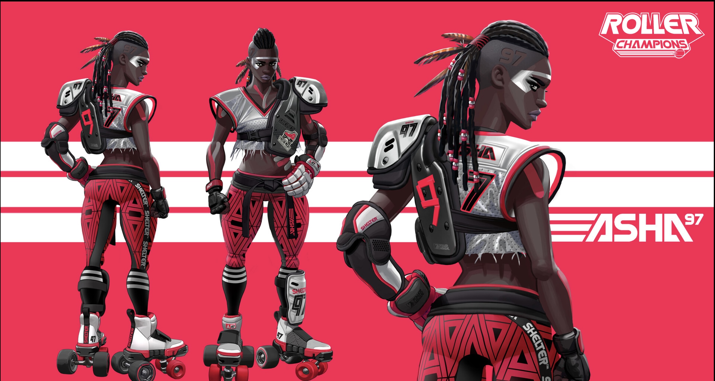
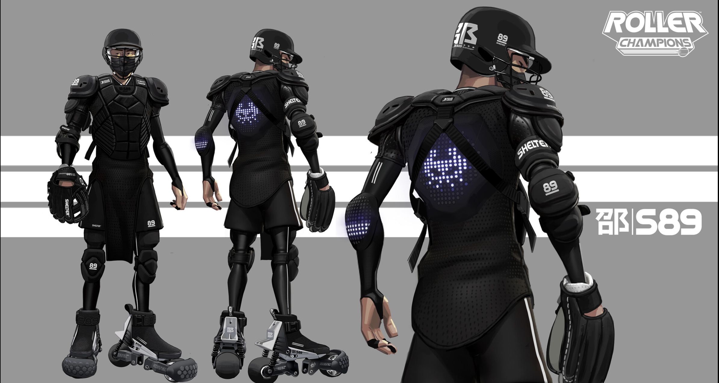
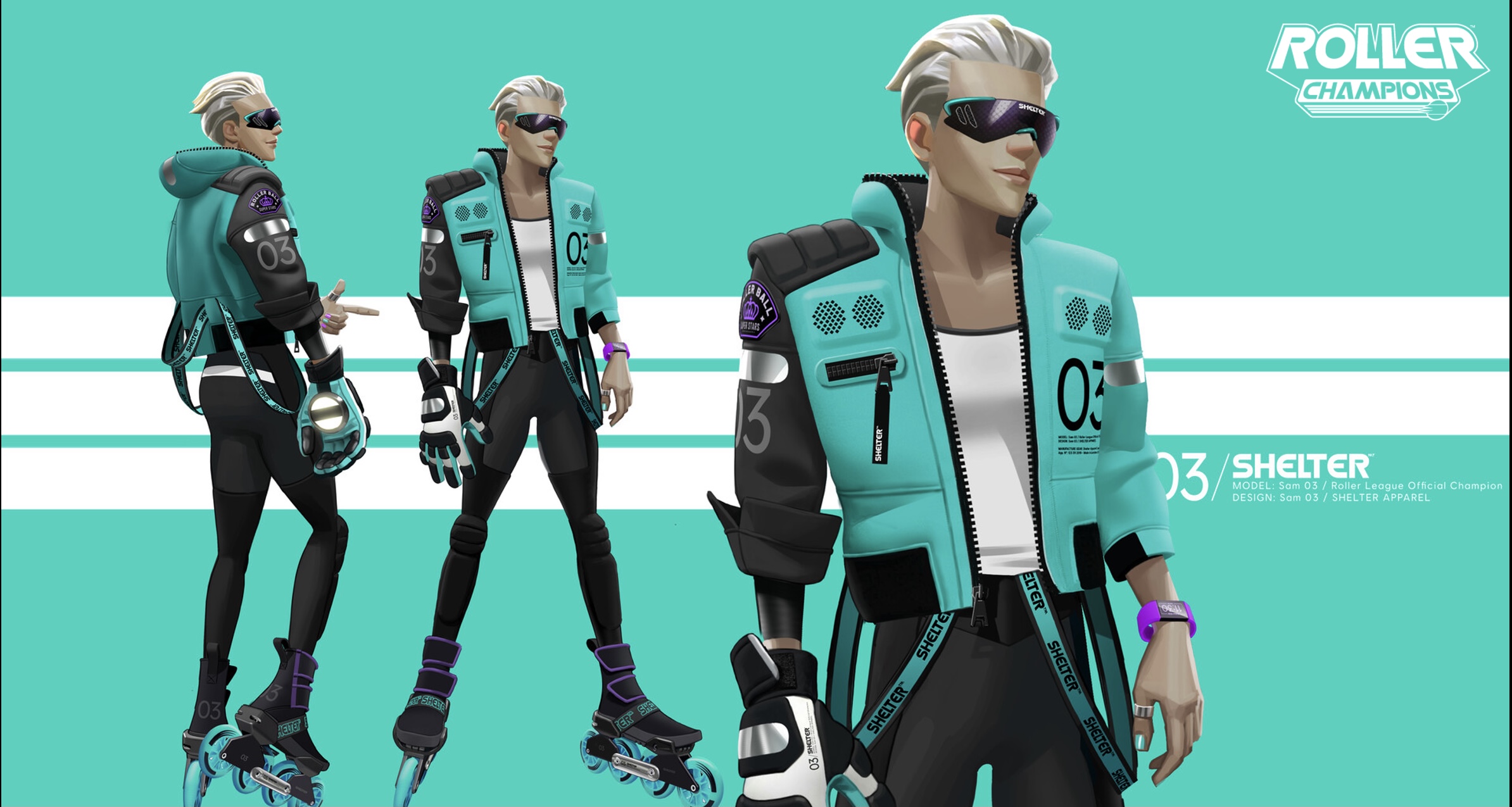
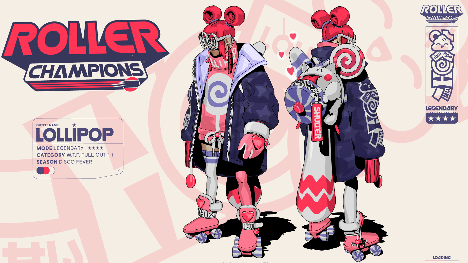
Directed the design and strategy of all skin lines, with a monetization approach rooted in entrepreneurial thinking. Developed a 4-slot system with season-based color matching, maximizing combination possibilities and encouraging multiple purchases. Skins could be acquired slot by slot at accessible price points, while full outfit bundles offered better value, driving higher ROI. Cross-team collaboration was essential to evaluate the production cost of each item versus its return, ensuring a balanced pipeline of high-impact items that didn't require excessive production resources. Created scalable design systems that could respond quickly to live game needs without heavy development cycles. Every skin line stayed true to the three founder tribes, ensuring each player community could find items that matched their identity and style.
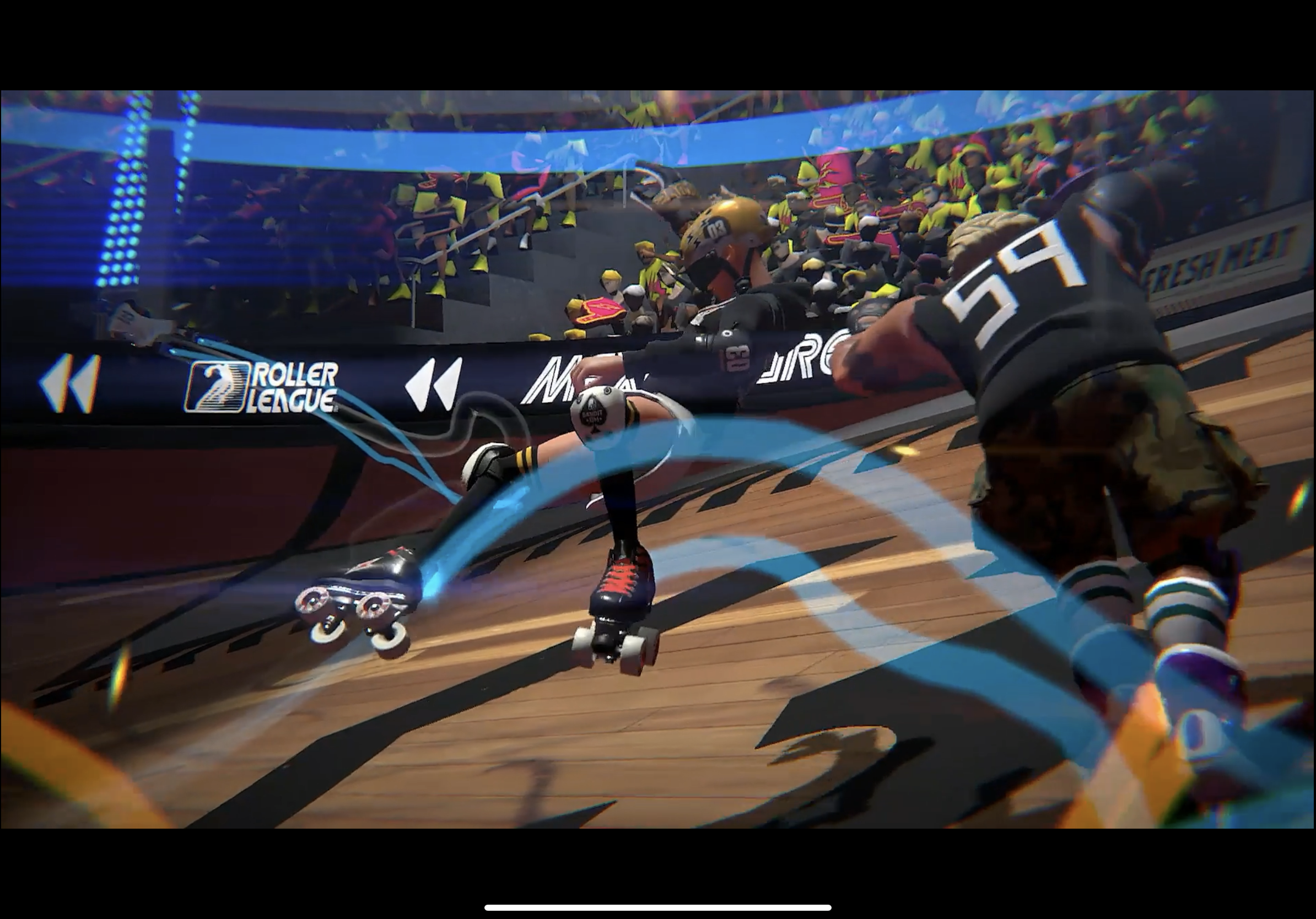
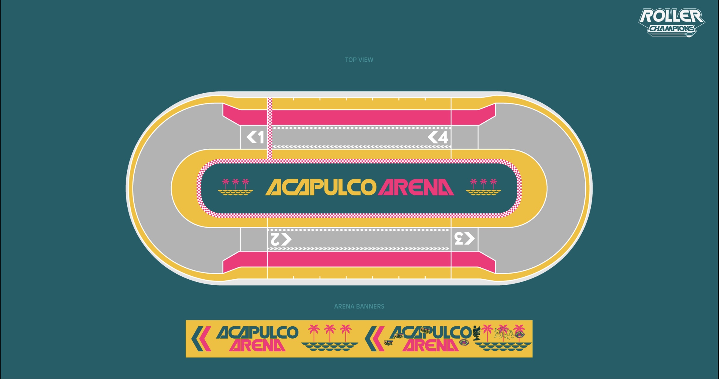
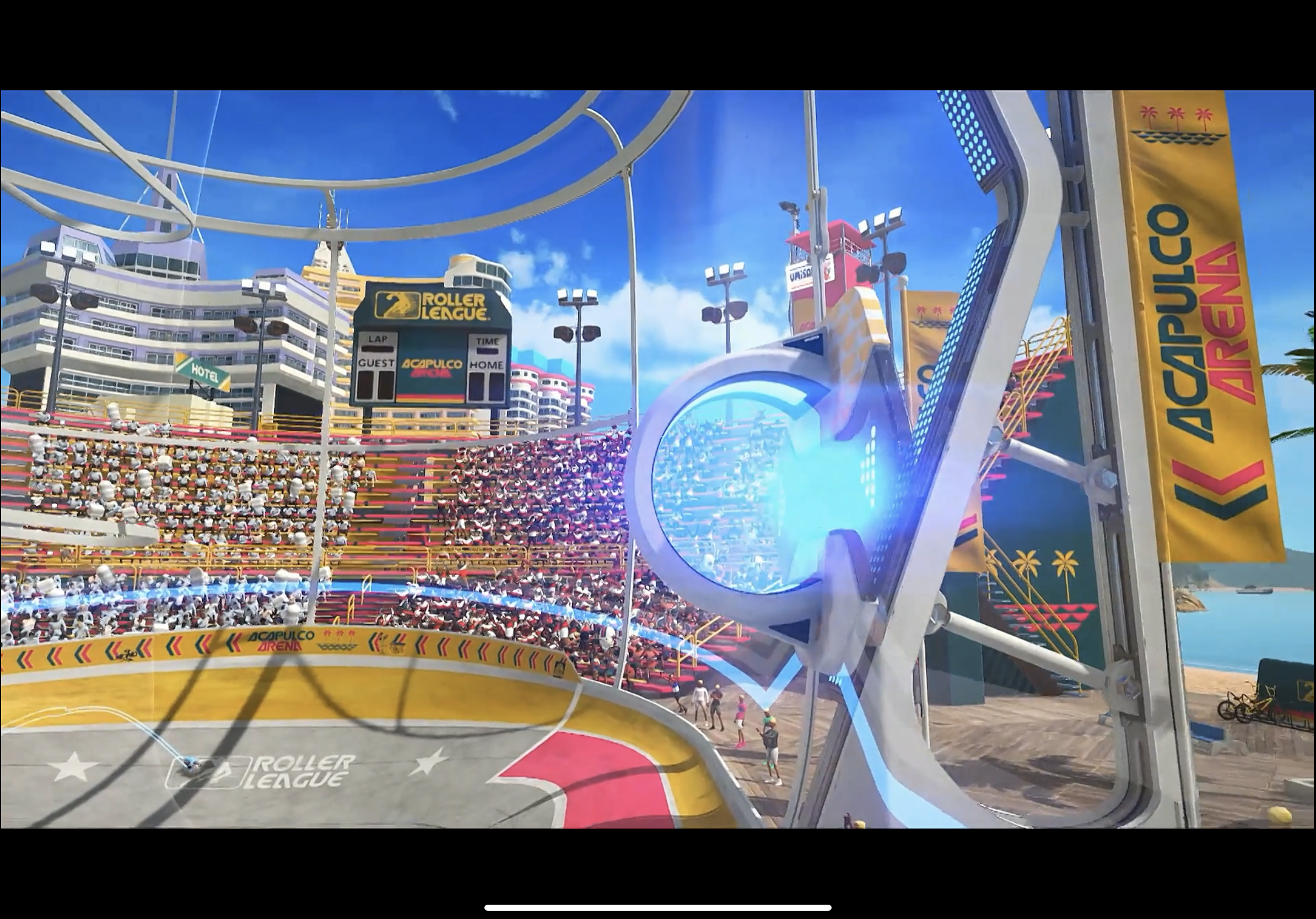
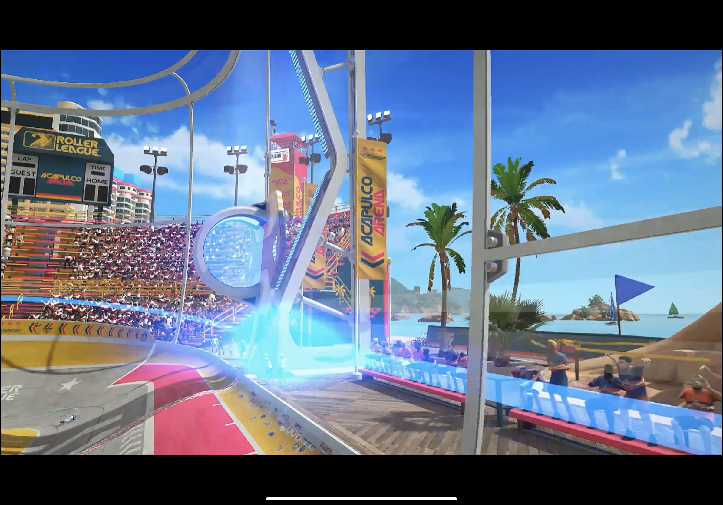
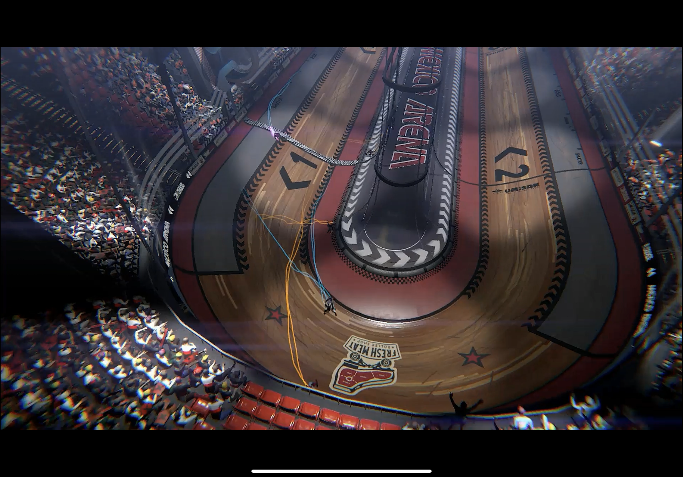
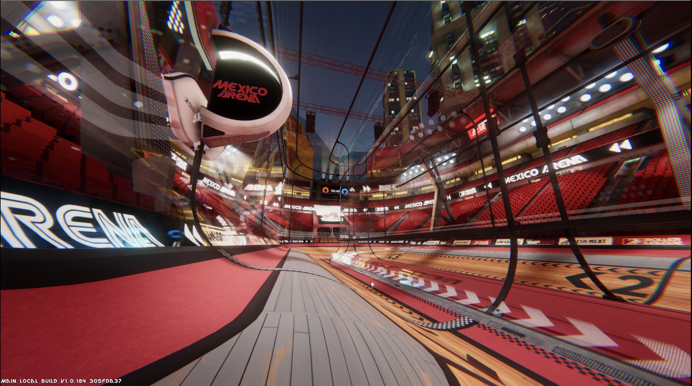
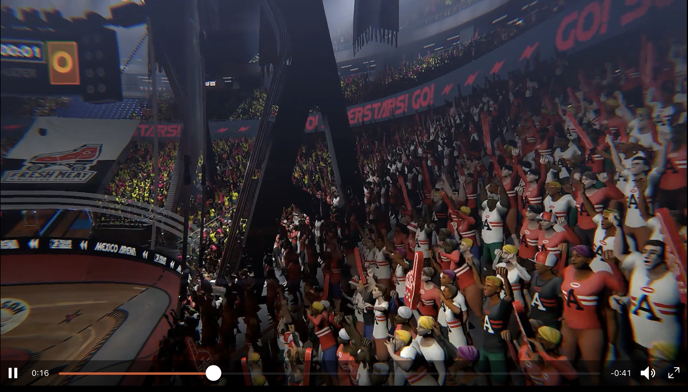
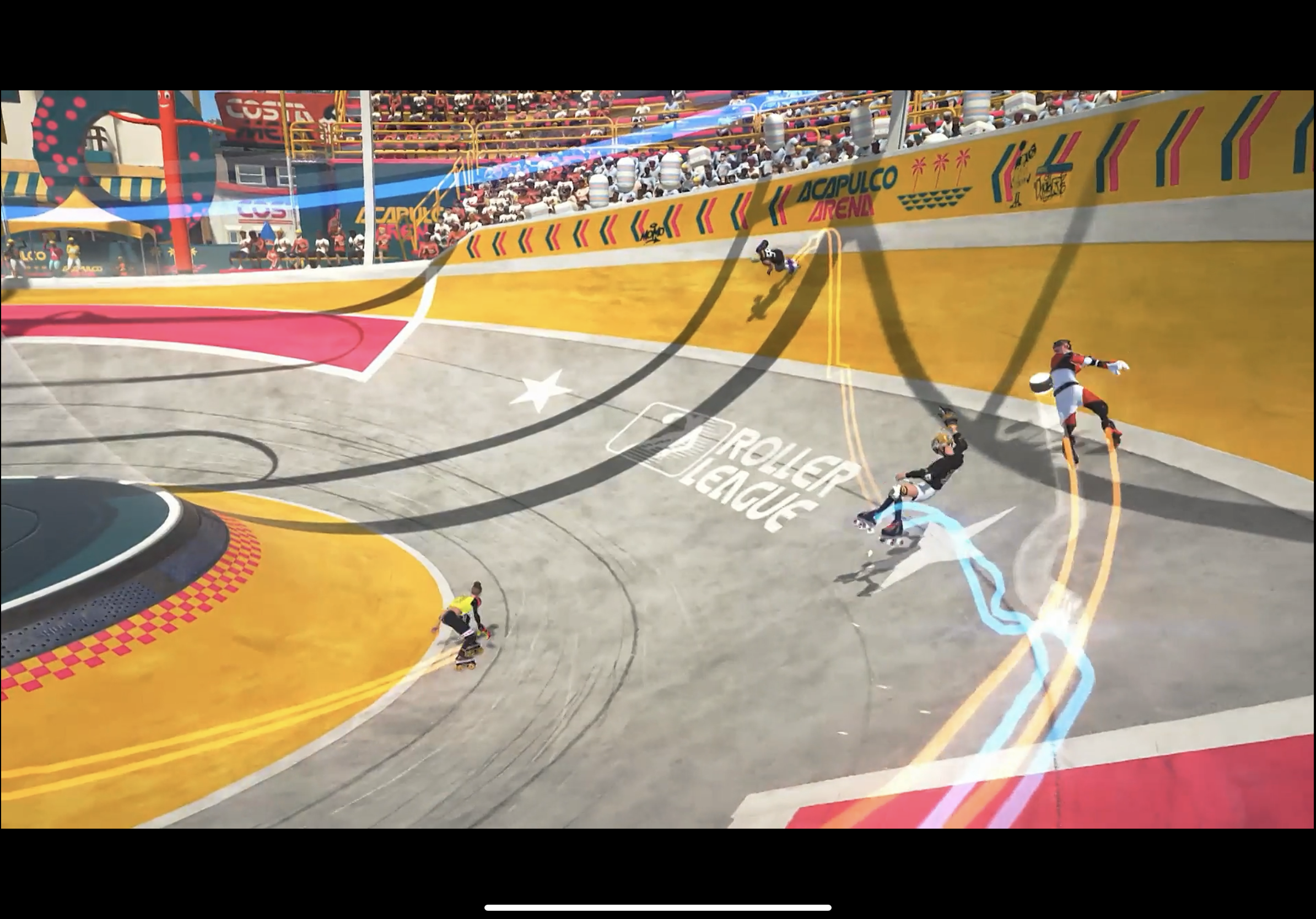
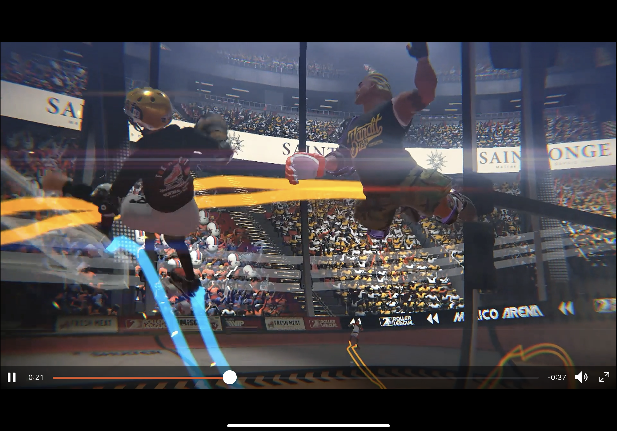
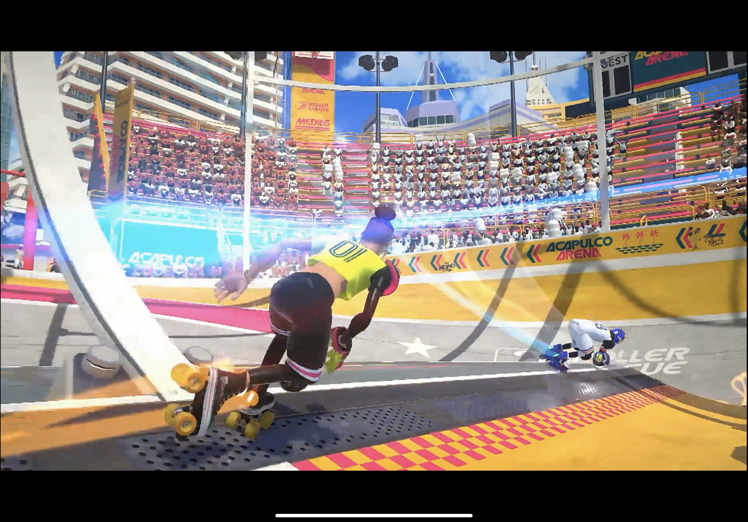
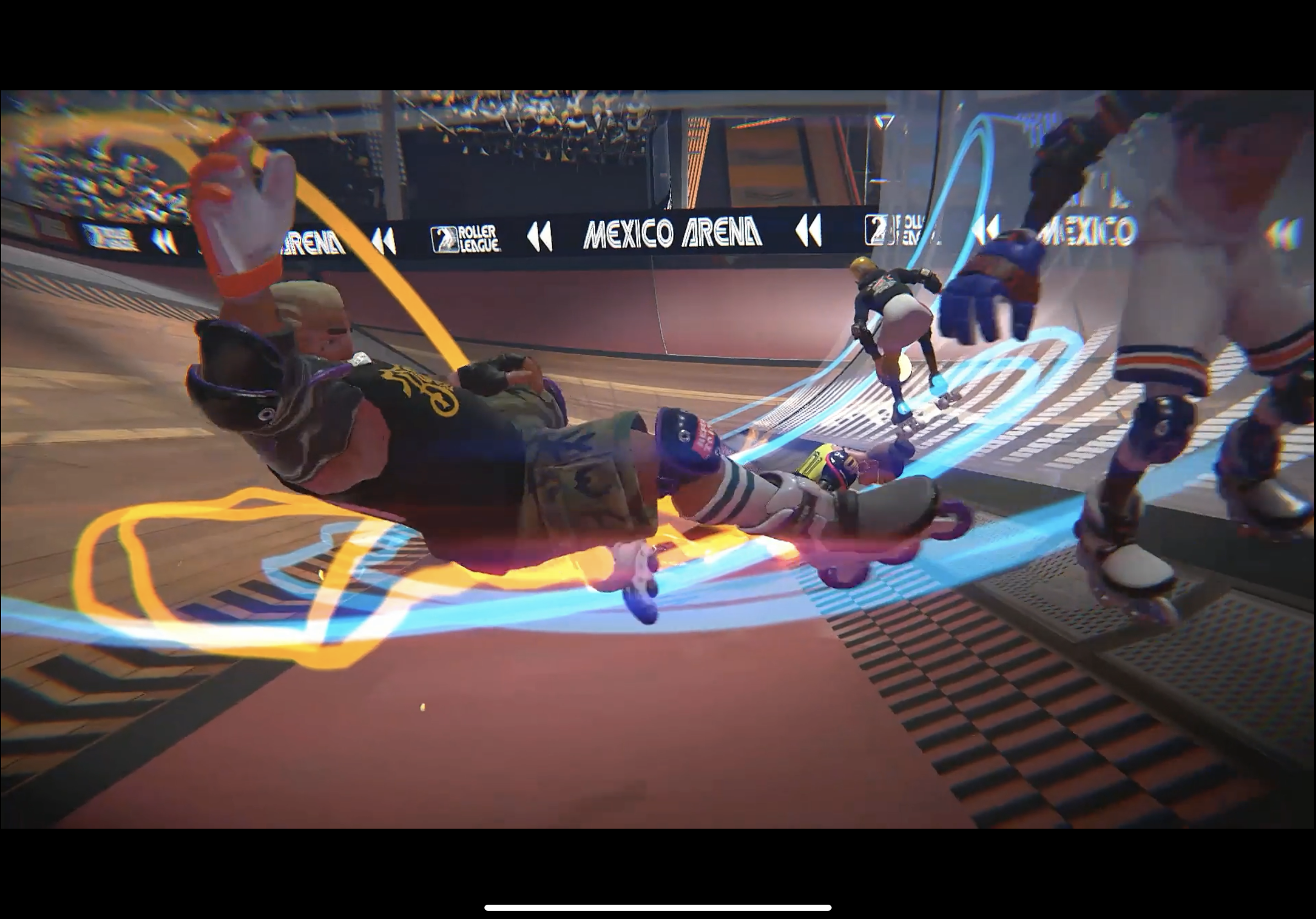
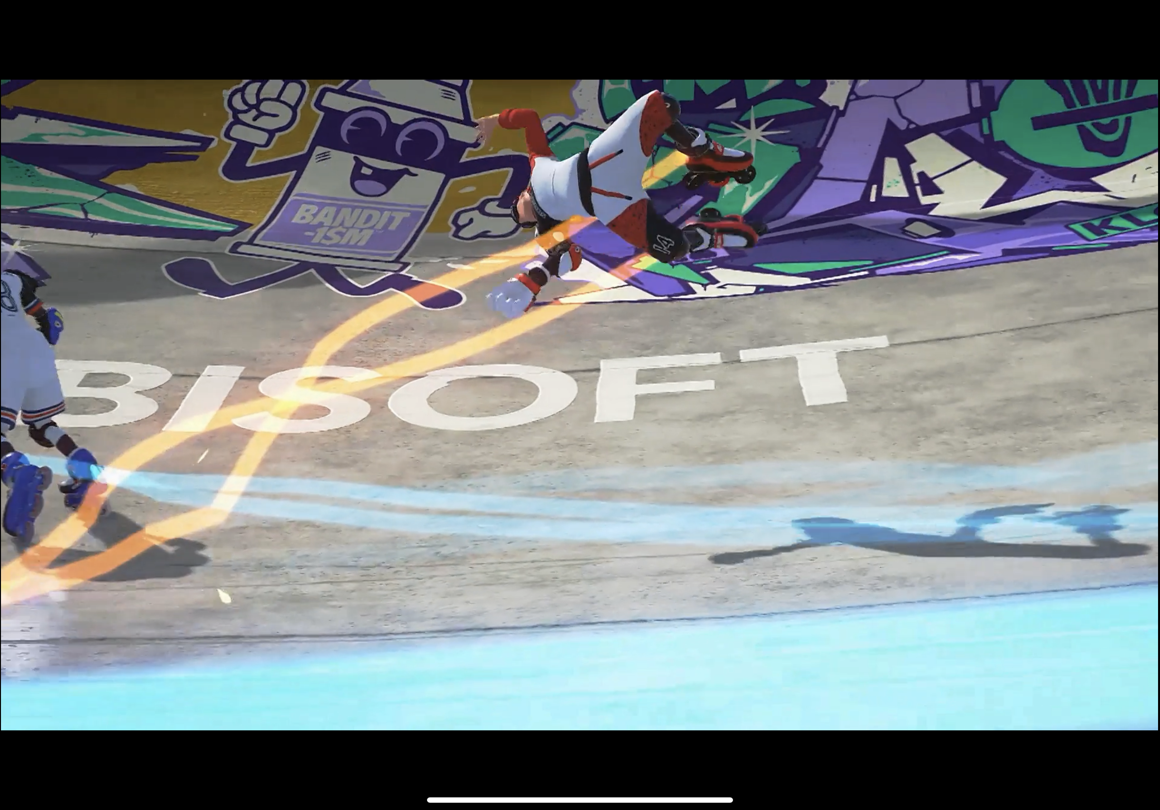
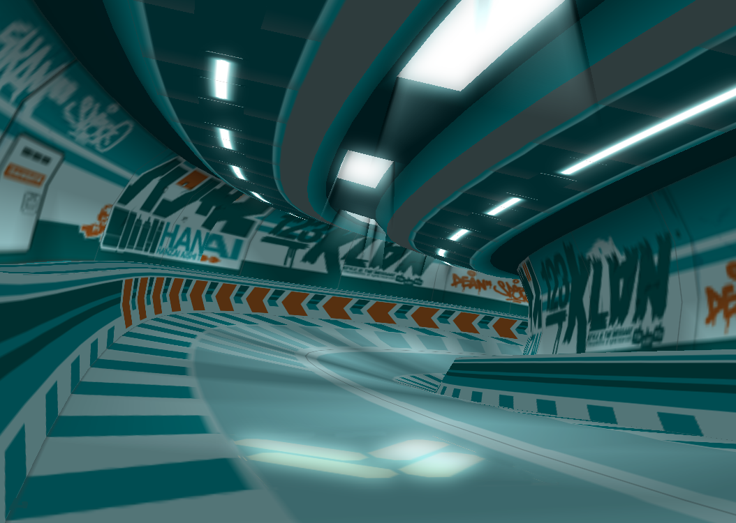
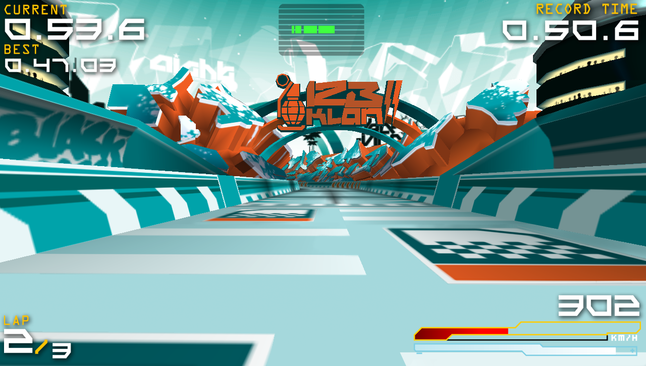
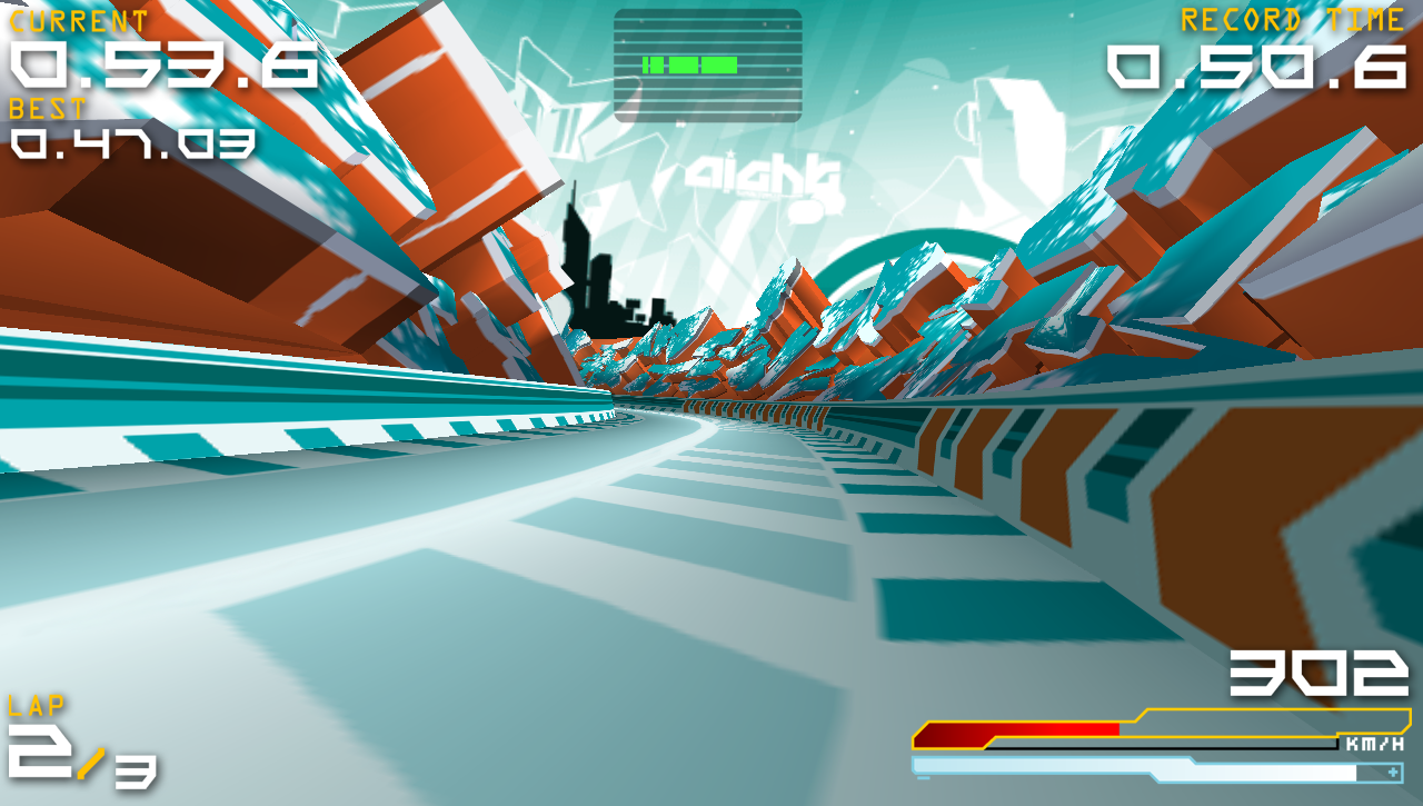
Conceptualized and directed every arena in the game from 2018 through March 2022, from location selection to cultural narrative to final visual identity. Each arena tells its own story rooted in a specific culture and geography, creating a diverse and immersive world tour for the player. Developed the neo-retro aesthetic that became the signature look of the game across all environments. Directed the crowd system, designing diverse and animated spectators that bring each arena to life. Every environment was art directed in close collaboration with the 3D and level design teams, from early 2D concepts through to final in-game renders.
From 2D concept to in-game. Arenas, environments, and crowd system.
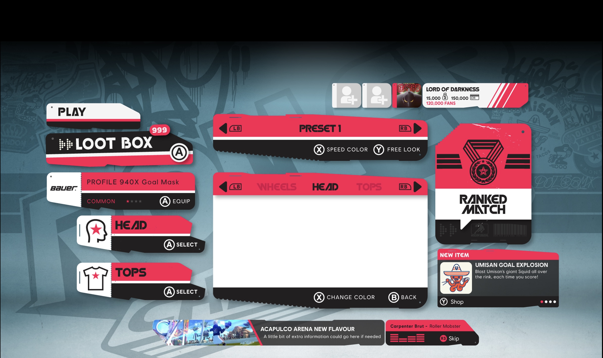
Art directed the entire user interface, ensuring it flowed naturally from the logo and brand identity established by the studio. The UI was designed as a true extension of the brand, where every element serves both the visual identity and the user experience. A well-crafted UI/UX directly impacts sales. Drawing from the studio's e-commerce experience, the purchasing flow was optimized for minimal friction, making every transaction as close to one click as possible. From the main menu to the in-game shop, Loot Box system, Ranked Match badges, and character customization screens, everything carries the same street-culture DNA as the rest of the game. Managed the UI team for all declinations once the design system was established.
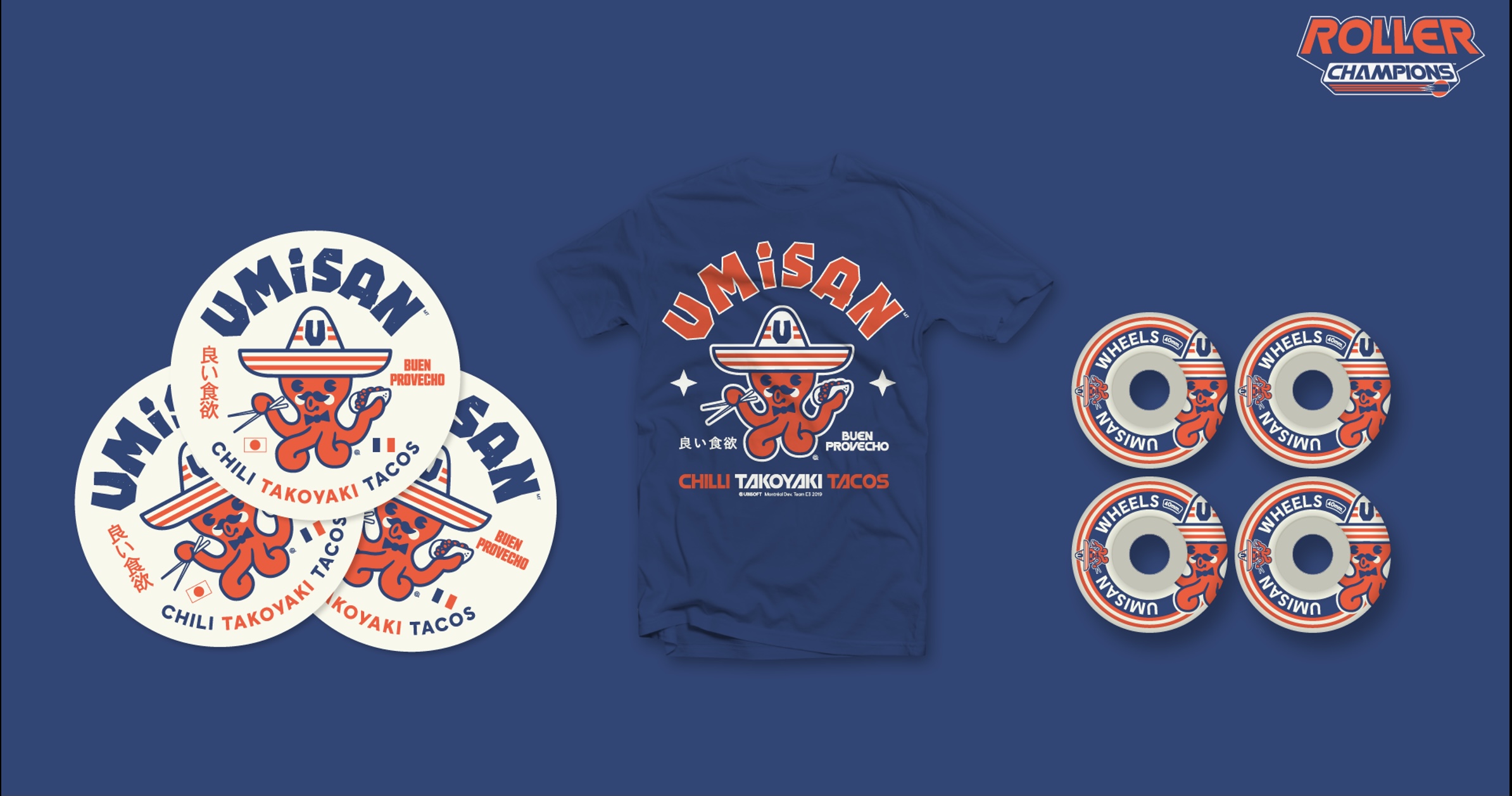
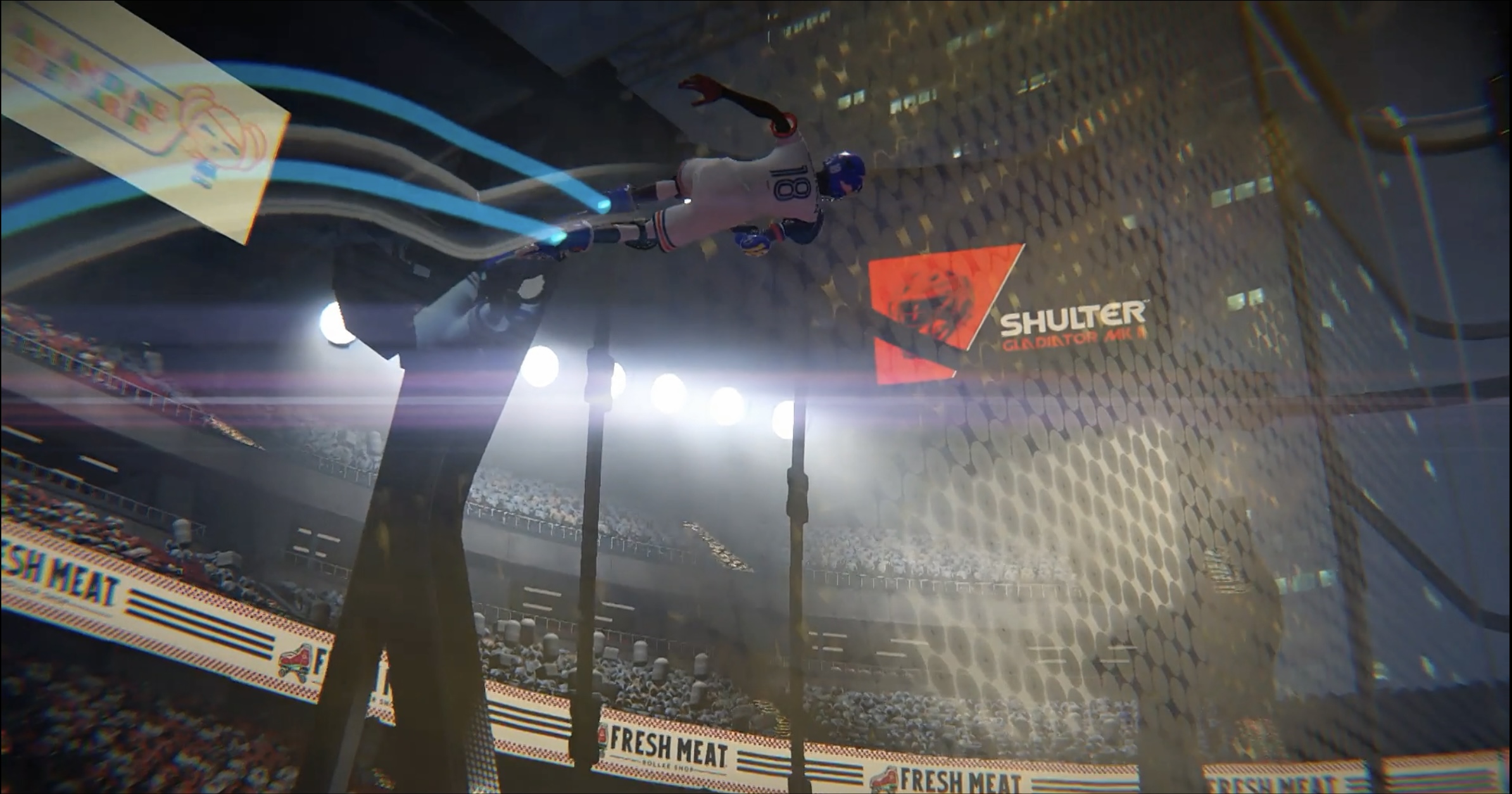
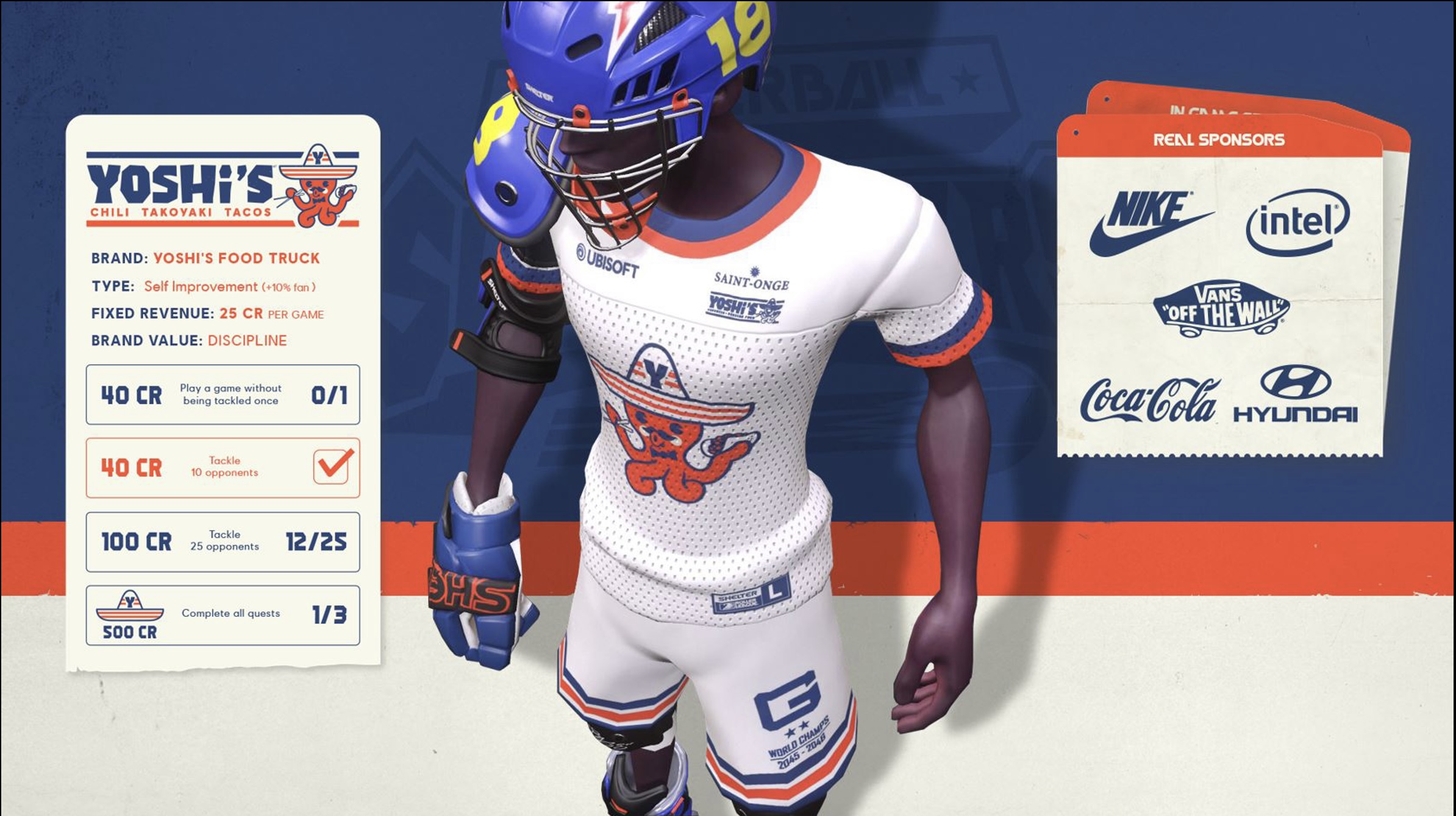
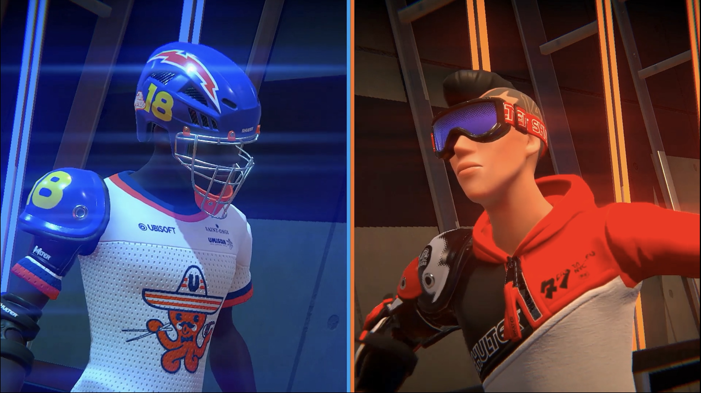
Directed the world building and visual culture across every environment in the game. the studio's unique street art DNA was embedded into the environment art and in-game branding, but this goes far beyond placing tags on walls. Every arena features a complete ecosystem of fictional sponsor logos, branded banners, arena patterns, goal designs, and environmental graphics, all conceptualized and art directed by Klor and Scien. The authenticity comes from 30+ years of real street culture experience. Nothing is fake or decorative. Every mural, every brand element like BANDIT-1SM, Fresh Meat, UMISAN, Shulter, and every surface pattern exists with purpose and cultural credibility, making the game world feel lived-in and genuine.
Designed and directed the merch strategy for Roller Champions, drawing directly from the studio's entrepreneurial background in fashion and brand development. Deep knowledge of the fashion industry, from production costs to materials to distribution, was a key asset in building credible in-game brands and realistic merch strategies. The long-term vision was to develop Shelter as a standalone brand extending beyond the game. This expertise also led to securing Gucci as an in-game sponsor, thanks to a pitch presentation that demonstrated real fashion industry understanding at the highest level.
Developed the UMISAN convention communication strategy. UMISAN, a fictional Japanese fusion food truck brand living within the game, was brought to life as real merchandise for gaming conventions. T-shirts were distributed without any visible Ubisoft branding, generating organic buzz as attendees asked each other where they got them. This approach drove more traffic to the Ubisoft booth than traditional branded merchandise ever could. A direct application of streetwear marketing instincts to the gaming industry.
Art directed the CG trailer produced by Helix studio, ensuring the visual identity and brand DNA were faithfully translated into cinematic format. Involved in the E3 2019 World Premiere reveal that introduced Roller Champions to the world.
Cinematic Trailer
E3 2019 — Official Trailer
Trailer
Arcadia Stadium
Sony Computer Entertainment Europe · 2007
Commissioned by Sony Computer Entertainment Europe for the European launch of the PSP, Klor and Scien were given full creative carte blanche on the game's signature circuit. Starting from the raw track layout provided by Sony's teams, we took ownership of the complete art direction of the 123K stage, from visual concept through to final delivery. Close collaboration with Sony's 3D, engine, and level design teams to translate the studio's graphic universe into a fully playable environment. Directed the design of 8 ships, each carrying a distinct visual identity, custom typography, and its own color system. UI design, PSP launch wallpapers, and sound FX direction were all part of the scope. A large-scale project released exclusively at console launch, within one of the most influential racing games in video game history.
Starting from the raw track wireframe provided by Sony's engineering teams, Klor and Scien developed the complete visual language of the circuit, from surface graphics to environmental architecture, integrating 30 years of street culture references into a high-speed futuristic world. The result was an environment that felt entirely distinct within the WipEout universe, recognizable and credible in equal measure.
The stage in-game. WipEout Pulse, Sony PSP.
Directed the visual identity of 8 ships for the 123K stage, each one a fully developed brand in itself. Mrs Klor, Scien, Dean, Sper, Skam, Reso, 3Hardcore, Kingz Destroy. Every ship carries its own logo, color palette, side panel graphics, and cockpit color, building a cohesive collection rooted in the studio's graphic universe while respecting the aerodynamic constraints of the WipEout aesthetic.
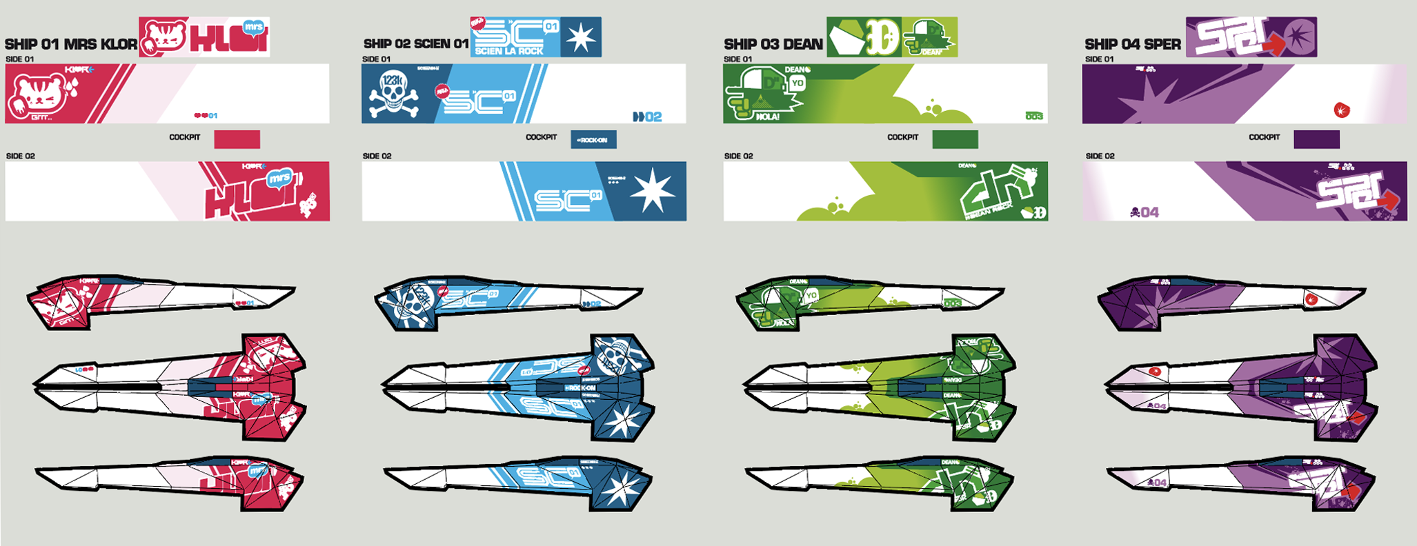
Ships 01–04. Mrs Klor, Scien La Rock, Dean, Sper.
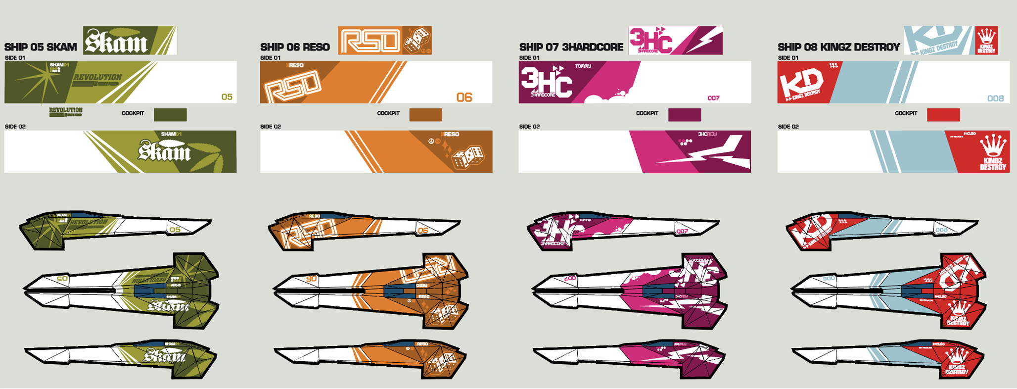
Ships 05–08. Skam, Reso, 3Hardcore, Kingz Destroy.
WipEout Pulse — 123K Stage Gameplay
As part of the PSP launch package, Klor and Scien designed an exclusive series of wallpapers distributed with the console, as well as the complete UI for the 123K stage. Each wallpaper is a standalone graphic piece, collectible in its own right, extending the studio's universe beyond the game itself.
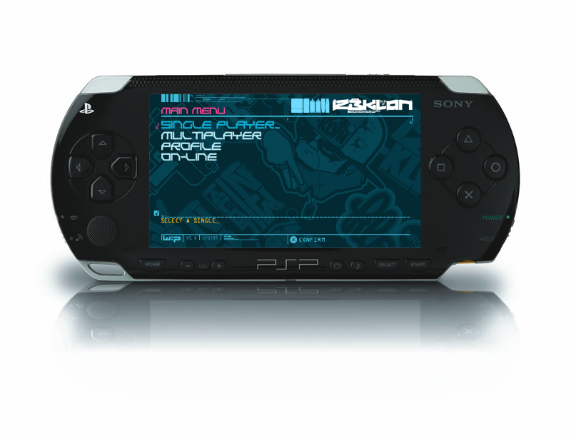
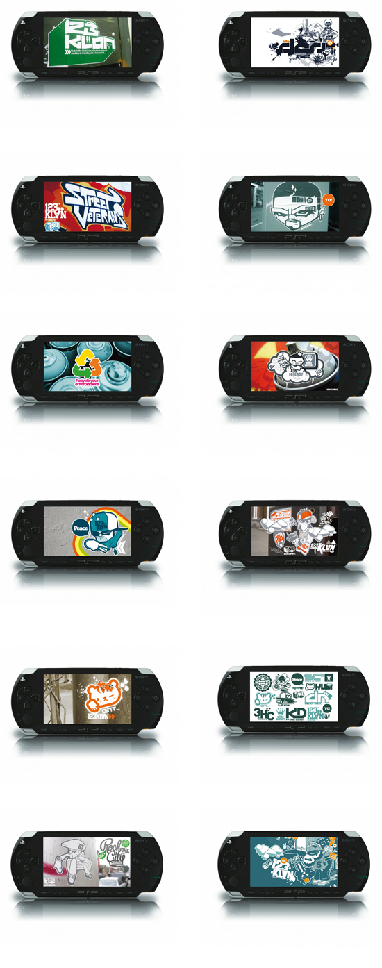
PSP launch wallpapers and UI design. 123K exclusive.
Atari · The Collective · 2006
Graffiti Art Direction, Character Design, Environment Design. Marc Ecko, a former writer himself, knew who to call. He had discovered the studio through the WipEout PSP track and understood that authenticity in a graffiti game could not be faked. Klor and Scien were brought in as the secret weapon of vectorial graffiti to design Decoy, Gabe33, Trane's signature pieces, and an entire environment built from wildstyle, throw ups, tags, and stencils. The deliberate challenge: delivering beginner-level work on purpose is harder than giving your best. Every wall in the game carries that discipline. Getting Up is one of the very few titles ever banned for excess of authenticity, refused classification in Australia for representing graffiti culture too accurately. No award compares to that.
Klor and Scien were the secret weapon behind Getting Up's graffiti. In 2006, they designed every significant piece in the game: Decoy, Gabe33, and Trane's signature work, plus the full environment graffiti across all 20 levels. Wildstyle, throw ups, tags, stencils. The deliberate challenge was to calibrate quality on purpose, delivering beginner-level work for certain characters while holding back the full force of their own style. Doing convincing "bad" graffiti is harder than giving your best.


Marc Ecko, a former writer himself, knew exactly who to call. He had discovered the studio through the WipEout PSP track and understood that authenticity in a graffiti game cannot be faked. What made Getting Up stand out was its commitment to the real thing on every level: the music selection (Mobb Deep, Eric B & Rakim, Notorious Big), the universe, and the graffiti. The game was eventually refused classification in Australia for representing graffiti culture too accurately. No award compares to that.
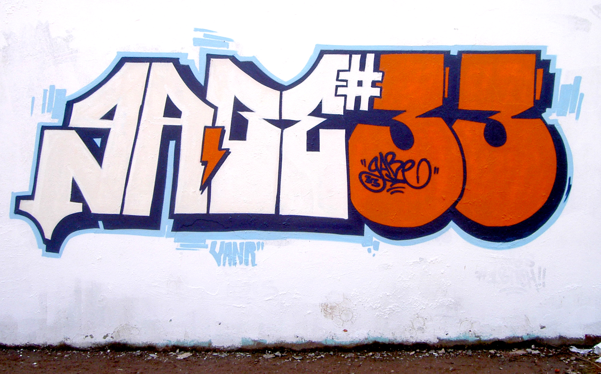
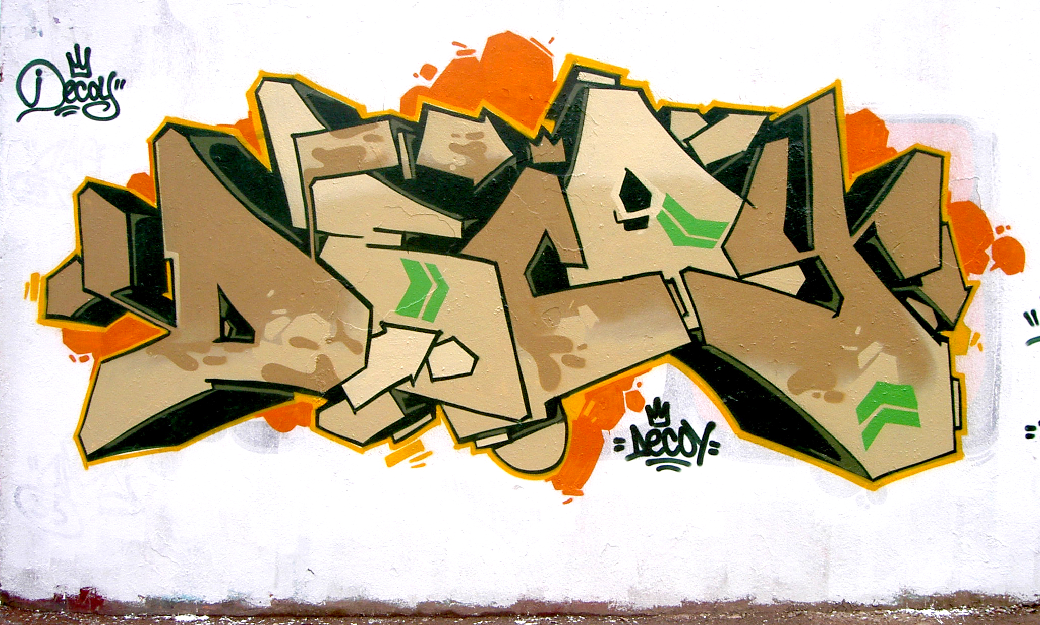


Decoy, Gabe33, Trane. Wildstyle, throw ups, environment pieces. Klor and Scien for Atari, 2006.
Capcom · 2010
The studio was selected by Capcom to contribute to the marketing campaign for the launch of Super Street Fighter IV. A full-scale poster, signature typography, Guile vs Adon, conceived to capture the raw energy of the game in a street and graphic language that is immediately recognizable. A direct commission, a strong deliverable.
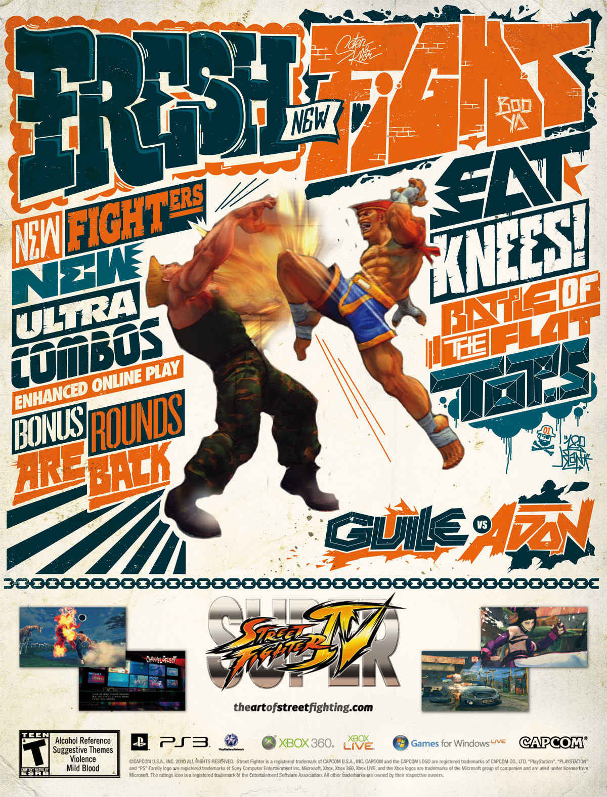
Super Street Fighter IV. Guile vs Adon. Klor and Scien for Capcom, 2010.
Riot Games · 2018
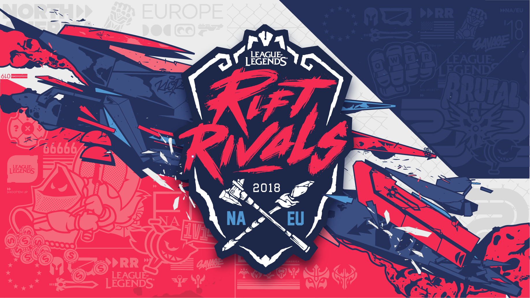
Commissioned by Riot Games for the complete visual identity of Rift Rivals 2018, an international League of Legends esports tournament held in South Korea, pitting the top competitive regions against each other. LCK, LPL, LMS. Full creative scope: event logo, hero frames featuring the competing players, on-stage backgrounds, all tournament assets, and the in-game login screen deployed globally within League of Legends during the event. One of the largest esports tournaments in the world, seen by millions of players and fans worldwide.
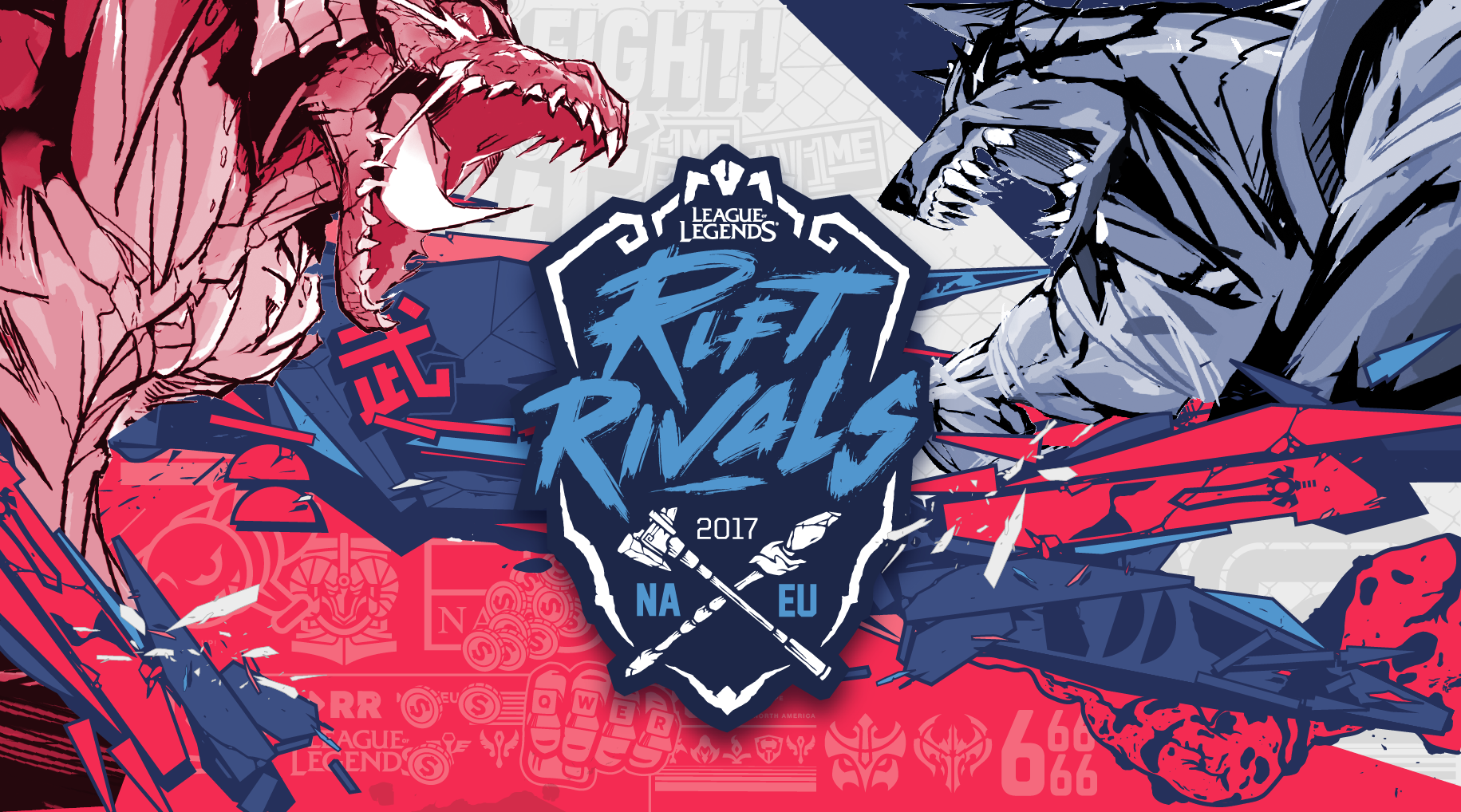
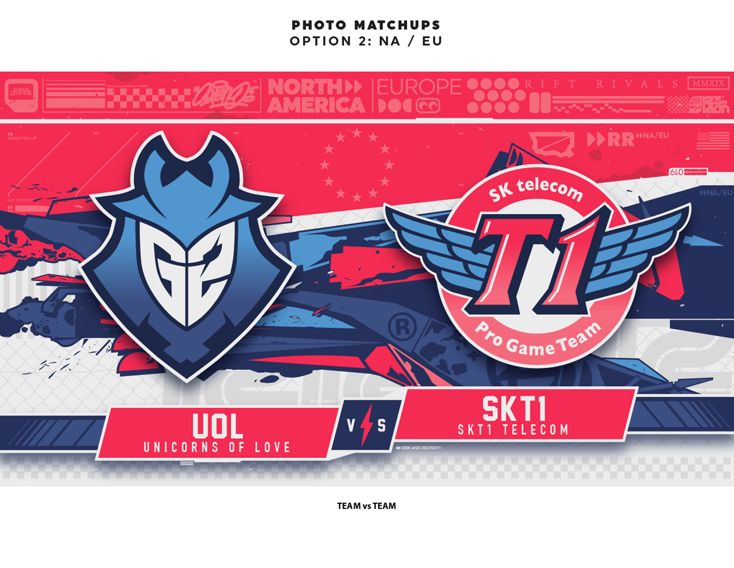
Event logo, player hero frames, stage backgrounds, and tournament assets.
Riot Games · Los Angeles Campus
Commissioned by Riot Games to create a large-scale mural on the walls of their Los Angeles campus. A full piece built around Phoenix, the Valorant agent, translated into our visual language. Characters, lettering, graffiti elements, and cultural references fused into a single mural that lives permanently on the Riot campus. The kind of project that happens when a brand trusts an artist completely.
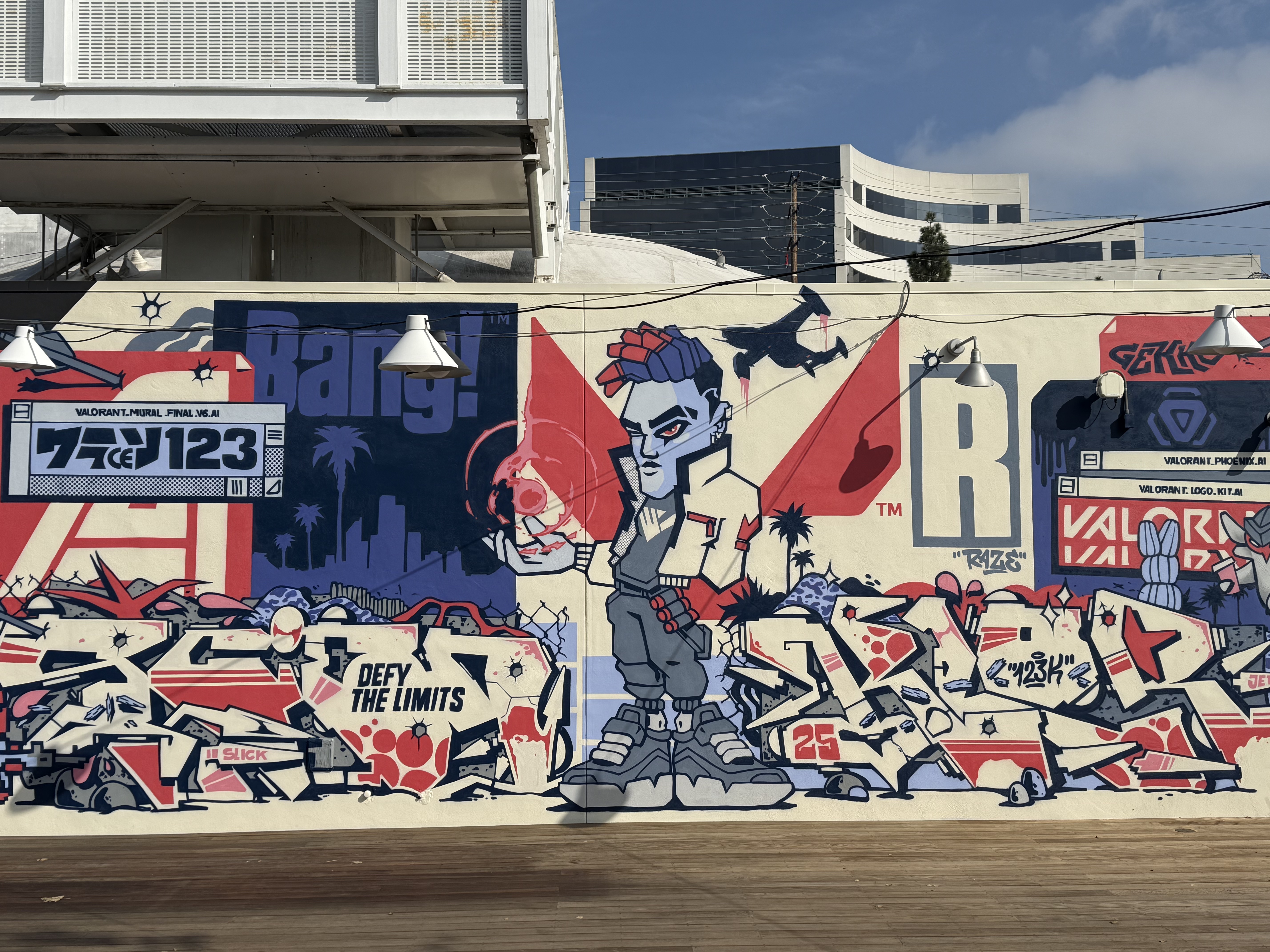
Valorant, Phoenix. Large-scale mural, Riot Games campus, Los Angeles.